How create a Responsive Horizontal HTML grid scroller


Let's say you are creating a fashion website and you need to display trending products, products with discounts or something else.
You might not want to display them in the same way as would display your normal product selection.
Well, in this tutorial you are going to learn how to display your products horizontally, and responsiveness across all devices included.

PREREQUISITES
Basic knowledge of HTML and CSS
Any text/editor (vscode will be used in this tutorial)
CREATE DIRECTORIES
Create a folder named scroller and create two files in it index.html and style.css and one folder img
Fill your image folder with about 7 or more images, 9 are being used in this tutorial.

CREATE HORINZONTAL DIV SCROLLER
Open your project folder in your text editor.

Copy and paste the following code into your HTML file;
<!DOCTYPE html>
<html lang="en">
<head>
    <meta charset="UTF-8">
    <meta http-equiv="X-UA-Compatible" content="IE=edge">
    <meta name="viewport" content="width=device-width, initial-scale=1.0">
    <link rel="stylesheet" href="style.css">
    <title>Document</title>
</head>
<body>
    <section class="trend">
        <div class="container">
          <h1 class="text">TRENDING COLLECTIONS</h1>
          <p class="new">Swipe right to see more items</p>

          <div class="product">
            <div class="item">
              <img src='' alt="">
              <div class="item-body">
                <h5 class="item-price"></h5>
                <p class="item" > SHOP NOW</p>
              </div>
            </div>
          </div>

        </div>
    </section>
</body>
</html>
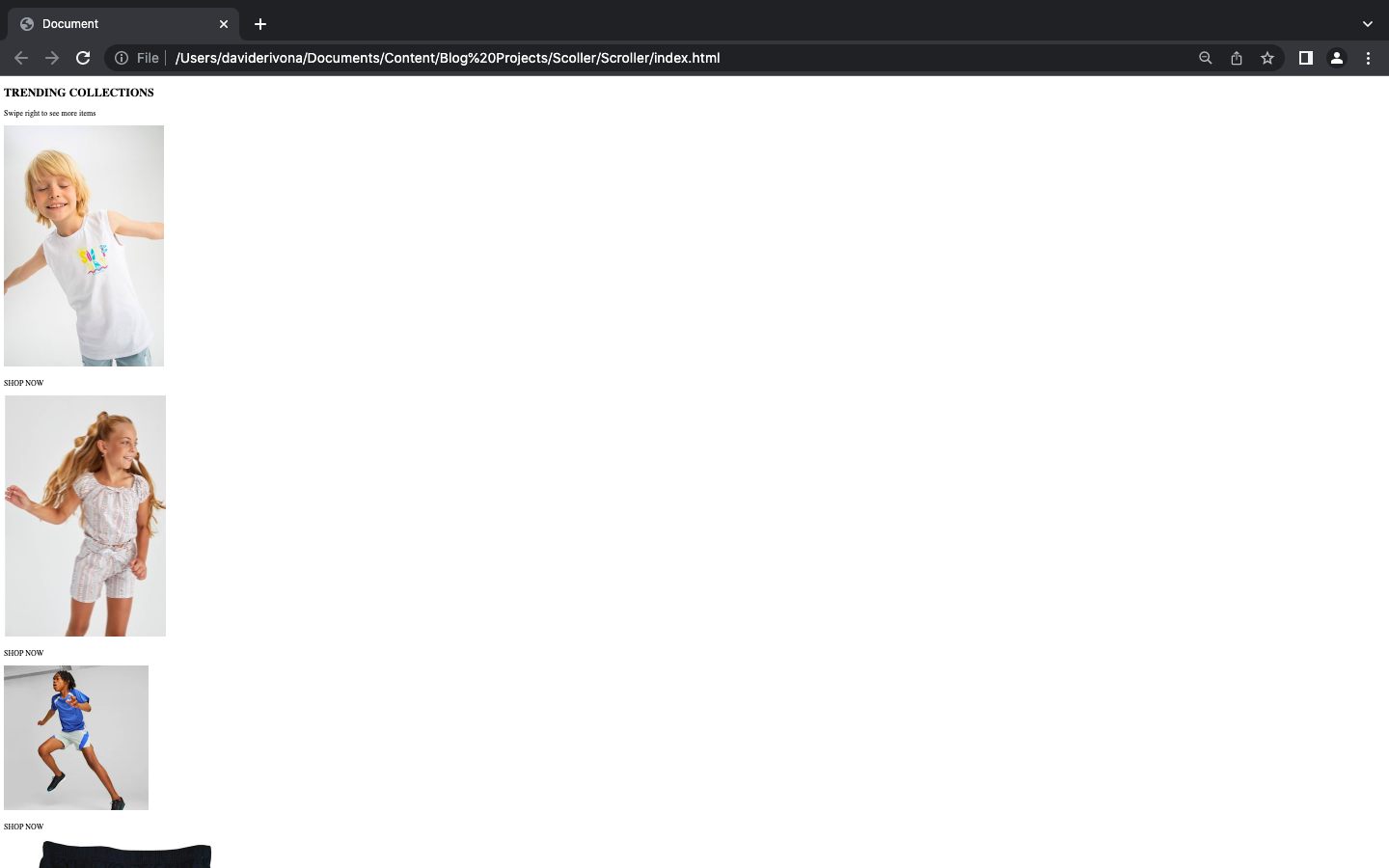
The above code just links our index.html to our style.css and also created a div section for our product.
Upon execution we should have this 👇;

Next, we duplicate the item div to the number of images we have in our img folder and also link the images.
get the images here
I have nine(9) images in my img folder so I will duplicate 9 times;
Code for duplicating;
<!DOCTYPE html>
<html lang="en">
<head>
    <meta charset="UTF-8">
    <meta http-equiv="X-UA-Compatible" content="IE=edge">
    <meta name="viewport" content="width=device-width, initial-scale=1.0">
    <link rel="stylesheet" href="style.css">
    <title>Document</title>
</head>
<body>
    <section class="trend">
        <div class="container">
          <h1 class="text">TRENDING COLLECTIONS</h1>
          <p class="new">Swipe right to see more items</p>

          <div class="product">

            <div class="item">
              <img src='img/Defacto Boy REGULAR FIT Knitted Athlete-White.jpg' alt="">
              <div class="item-body">
                <h5 class="item-price"></h5>
                <p class="item" > SHOP NOW</p>
              </div>
            </div>


            <div class="item">
              <img src='img/Defacto Girl Short Sleeve Blouse - Multi.jpg' alt="">
              <div class="item-body">
                <h5 class="item-price"></h5>
                <p class="item" > SHOP NOW</p>
              </div>
            </div>

            <div class="item">
              <img src='img/Fit Big Kids Woven Shorts.webp' alt="">
              <div class="item-body">
                <h5 class="item-price"></h5>
                <p class="item" > SHOP NOW</p>
              </div>
            </div>

            <div class="item">
              <img src='img/Go Jetters Boys 3 Pack Pant.jpg' alt="">
              <div class="item-body">
                <h5 class="item-price"></h5>
                <p class="item" > SHOP NOW</p>
              </div>
            </div>

            <div class="item">
              <img src='img/Graphic Tee and Short Set.webp' alt="">
              <div class="item-body">
                <h5 class="item-price"></h5>
                <p class="item" > SHOP NOW</p>
              </div>
            </div>

            <div class="item">
              <img src='img/Nike I.A.I.R Fleece Shorts.webp' alt="">
              <div class="item-body">
                <h5 class="item-price"></h5>
                <p class="item" > SHOP NOW</p>
              </div>
            </div>

            <div class="item">
              <img src='img/T7 Vacay Queen Big Kids Tee.webp' alt="">
              <div class="item-body">
                <h5 class="item-price"></h5>
                <p class="item" > SHOP NOW</p>
              </div>
            </div>

            <div class="item">
              <img src='img/Ozlem Children Singlets For Girls- 6in1 White.jpg' alt="">
              <div class="item-body">
                <h5 class="item-price"></h5>
                <p class="item" > SHOP NOW</p>
              </div>
            </div>

            <div class="item">
              <img src='img/Young ladies dark underwear.webp' alt="">
              <div class="item-body">
                <h5 class="item-price"></h5>
                <p class="item" > SHOP NOW</p>
              </div>
            </div>


          </div>
        </div>
    </section>
</body>
</html>
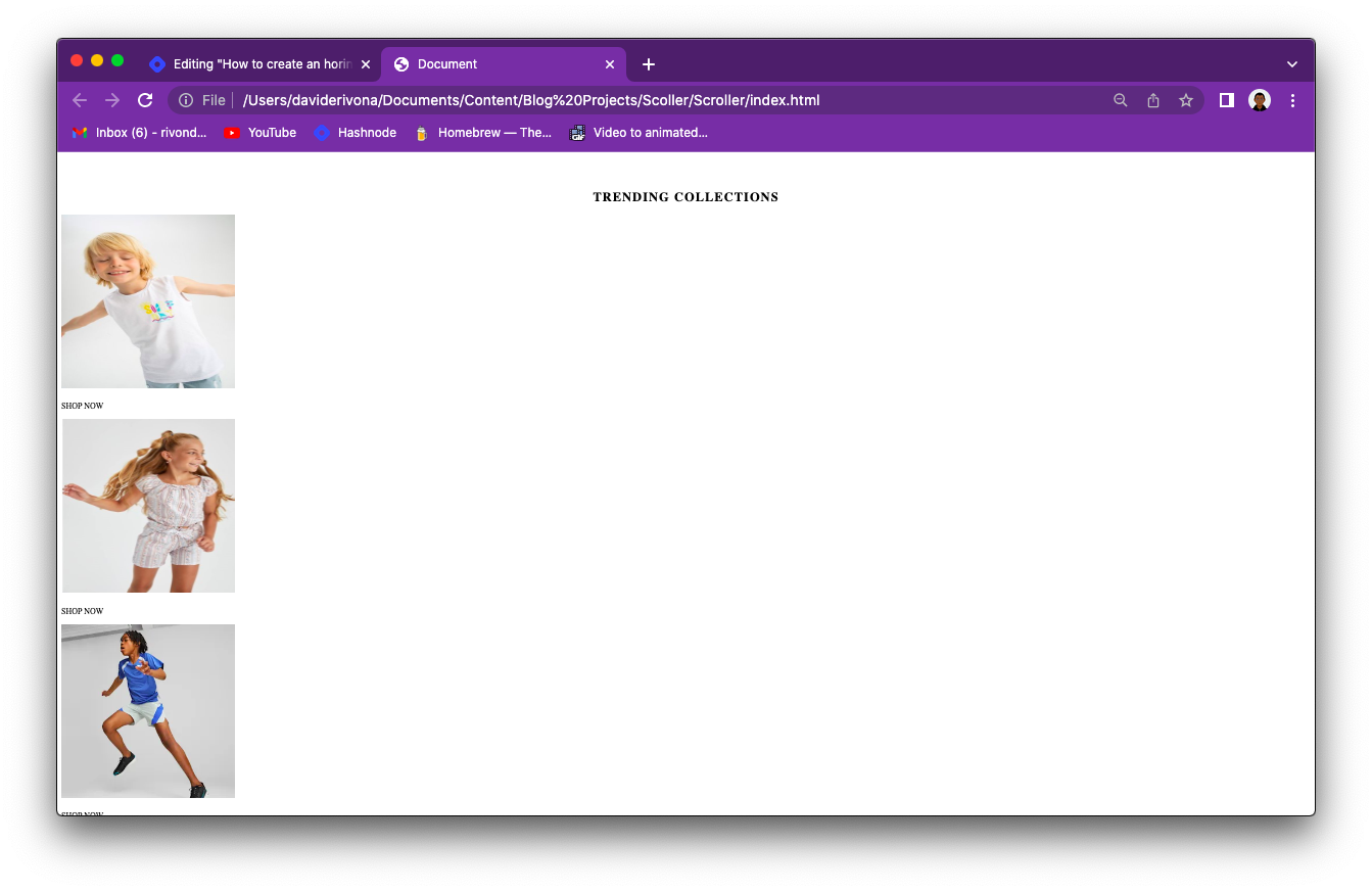
After linking your images, you should have this 👇
First, we style the trend section and edit its margin, padding, image width, font size and so on.
Copy and paste the following code into your CSS file;
/* TREND */
.trend{
    margin-top: 100px;
    margin-bottom: 50px;
  }
  .trend p.new{
    text-align: center;
    display: none;
  }
  .trend p.item{
    cursor: pointer;
  }
  .trend h1{
    text-transform: uppercase;
    color: black;
    font-size: 25px;
    text-align: center;
    font-weight: bold;
    letter-spacing: 2px;
  }
  .trend img{
    width: 340px;
    height: 340px;
}
You will notice a change in the padding and similar width and height across all images.
Now let's make it scroll horizontally
Copy and paste the following code into your CSS;
.product{
    --spacer:1rem;
    display: grid;
    grid-auto-flow: column;
    gap: -1%;
    grid-auto-columns: 18%;
    padding: 0 10px 0 10px;
    overflow-x: auto;
    overscroll-behavior-inline:contain ;
}

.item {
    display: grid;
    grid-template-rows: min-content;
}
You should have this 👇;
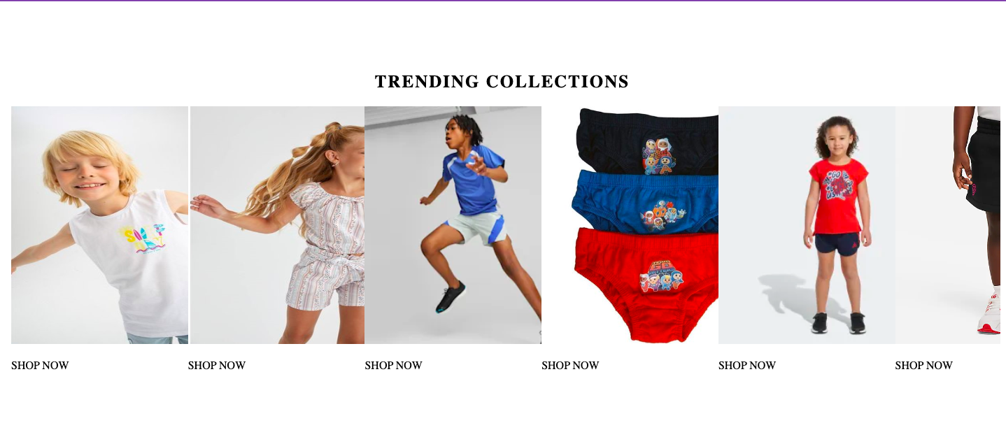
Images seem to overlap with each other;
Upon reducing screen size, we have👇;

The above size is 768px;
It isn't responsive on the normal laptop screen size due to complications on smaller screen sizes, so we started from a larger screen size (2560px) and reduced the gap and width of the image across multiple device widths.
The most important thing is that it scrolls lol 😊;
Now comes the interesting part;

Copy and paste the following code into your CSS file;
@media(max-width:1950px){
    .product{
        gap: 1%;
    }
}

@media(max-width:1870px){
    .product{
        gap: 2%;
    }
}

@media(max-width:1780px){
    .product{
        gap: 3%;
    }
}

@media(max-width:1690px){
    .product{
        gap: 4%;
    }
}

@media(max-width:1620px){
    .product{
        gap: 5%;
    }
}

@media(max-width:1550px){
    .product{
        gap: 6%;
    }
}

@media(max-width:1480px){
    .product{
        gap: 7%;
    }
}

@media(max-width:1420px){
    .product{
        gap: 8%;
    }
}

@media(max-width:1370px){
    .product{
        gap: 9%;
    }
}

@media(max-width:1310px){
    .product{
        gap: 10%;
    }
}

@media(max-width:1270px){
    .product{
        gap: 11%;
    }
}

@media(max-width:1220px){
    .product{
        gap: 12%;
    }
}

@media(max-width:1190px){
    .product{
        gap: 13.5%;
    }
}

@media(max-width:1150px){
    .product{
        gap: 11%;
    }
    .trend img{
        width: 300px;
        height: 300px;
    }
}

@media(max-width:1100px){
    .trend img{
        width: 290px;
        height: 290px;
    }
}

@media(max-width:1050px){
    .product{
        gap: 9%;
    }
    .trend img{
        width: 250px;
        height: 250px;
    }
}

@media(max-width:1000px){
    .trend img{
        width: 230px;
        height: 230px;
    }
}

@media(max-width:920px){
    .product{
        gap: 10%;
    }
    .trend img{
        width: 230px;
        height: 230px;
    }
}

@media(max-width:880px){
    .product{
        gap: 11%;
    }
}

@media(max-width:850px){
    .product{
        gap: 13%;
    }
}

@media(max-width:800px){
    .product{
        gap: 13%;
    }
    .trend img{
        width: 210px;
        height: 210px;
    }
}

@media(max-width:730px){
    .product{
        gap: 15%;
    }
}

@media(max-width:690px){
    .product{
        grid-auto-columns: 23%;
        gap: 15%;
    }
    .trend img{
        width: 220px;
        height: 220px;
    }
}

@media(max-width:630px){
    .product{
        grid-auto-columns: 13%;
        gap: 19%;
    }
    .trend img{
        width: 170px;
        height: 170px;
    }
}

@media(max-width:580px){
    .product{
        grid-auto-columns: 13%;
        gap: 20%;
    }
}

@media(max-width:560px){
    .product{
        grid-auto-columns: 20%;
        gap: 12%;
    }
    .trend img{
        width: 150px;
        height: 150px;
    }
}

@media(max-width:530px){
    .product{
        gap: 13%;
    }
}

@media(max-width:500px){
    .product{
        gap: 14%;
    }
}
@media(max-width:490px){
    .product{
        gap: 15%;
    }
}
@media(max-width:470px){
    .product{
        gap: 16%;
    }
}
@media(max-width:460px){
    .product{
        gap: 17.5%;
    }
}

@media(max-width:445px){
    .product{
        gap: 19%;
    }
}

@media(max-width:430px){
    .product{
        gap: 20%;
    }
}

@media(max-width:415px){
    .product{
        gap: 22.5%;
    }
}

@media(max-width:400px){
    .product{
        gap: 24.5%;
    }
}

@media(max-width:385px){
    .product{
        gap: 26%;
    }
}

@media(max-width:370px){
    .product{
        gap: 27.5%;
    }
}

@media(max-width:360px){
    .product{
        gap: 29%;
    }
}

@media(max-width:350px){
    .product{
        gap: 32%;
    }
}

@media(max-width:330px){
    .product{
        gap: 35%;
    }
}

@media(max-width:315px){
    .product{
        gap: 40%;
    }
}

@media(max-width:300px){
    .product{
        gap: 42%;
    }
}

@media(max-width:290px){
    .product{
        gap: 45%;
    }
}
You should have this 👇;

We did it!

CONCLUSION
Get the source code here
Ensure to like and follow if you found this useful, Thanks.
Made with ❤️ by rivondave


